Much more than a CMS
FireCMS is an open source headless admin panel built by developers for developers.
Get a back-office app/dashboard for your Firebase project in no time.
Manage your
FireCMS is more than a CMS. It's a fully extendable app that will become the heart of your project.
Enjoy the most powerful features of Firebase and build your own custom back-office app/admin panel in no time.
Easy to get started, easy to customize and easy to extend. FireCMS is great both for existing projects, since it will adapt to any database structure you have, as well as for new ones.
I've tried many other CMS including Strapi, Sanity, contentful, Builder.io, none of them gave me better experience than FireCMS!
~ Fulei HuangSoftware Engineer, Microsoft
I think you have the best noSQL headless CMS on the market
~ Viktor VinnkCountry Digital Development Leader, Ikea
We are early adopters of FireCMS (and very proud of it) and it gives us a lot of flexibility and ease of integration of anything we develop.
~ Manuel PinillaFounder, OikosBrain
It is a great initiative towards building a scalable and serverless CMS as Firebase is serverless. UI is very nice and working is very smooth.
~ Muhammad BilalEngineering, CodeViz Technology
Trusted by
...and thousands more!
Advanced Editing Features
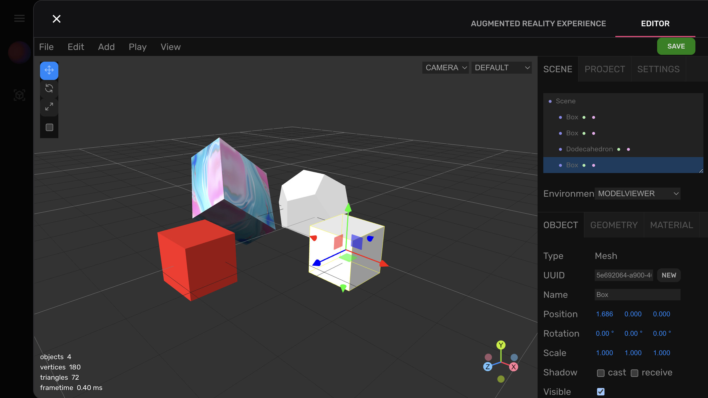
FireCMS offers both flexibility and an excellent user experience. Edit your collections and entities using a user-friendly spreadsheet view and effective forms.
FireCMS creates CRUD views based on your configurations with ease. It's simple to set up for common cases and just as easy to extend and customize to fit your specific needs.
FireCMS imposes no data structure restrictions, allowing seamless integration with any project right from the start.
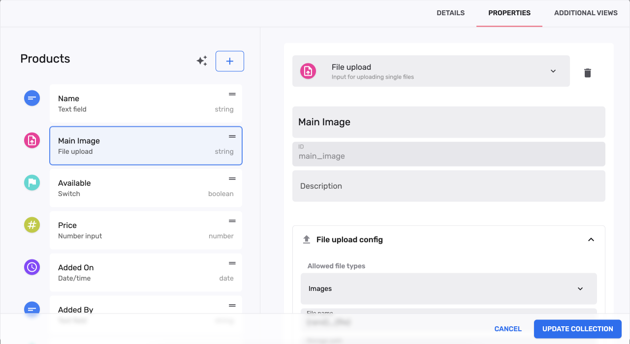
Simple and Flexible Customization
FireCMS offers developers an easy way to adapt the platform to their specific needs while keeping the initial setup simple. Our practical defaults can be conveniently overridden or expanded.
Effortlessly integrate your custom form fields as React components and preview widgets. Moreover, you can create detailed views related to your entities or within the main navigation for a truly customized experience.
For developers
const price = buildProperty({
    name: "Price",
    description: "Price with range validation",
    dataType: "number",
    validation: {
        required: true,
        requiredMessage: "Price must be between 0 and 1000",
        min: 0,
        max: 1000
    }
});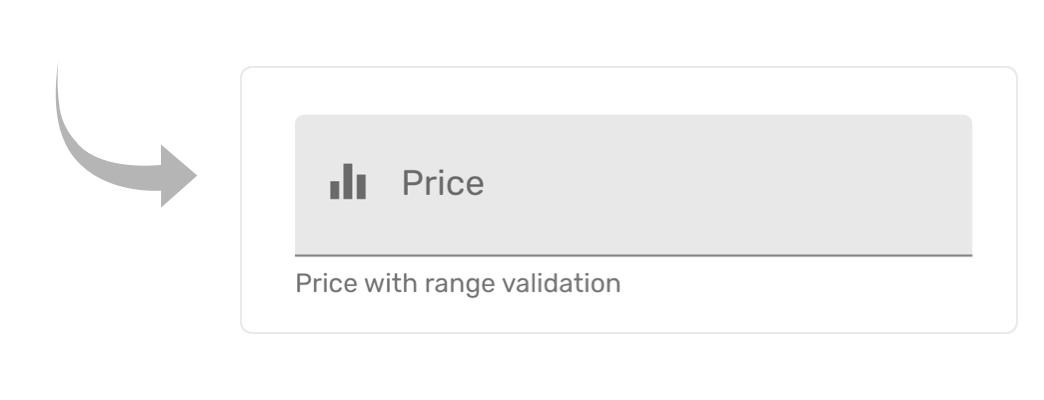
Easy schema definition
Define your schemas and choose from multiple form widgets and validation options.
Use advanced features like conditional logic for your fields, references to other collections, markdown or file uploads
FireCMS provides a powerful schema definition API that allows you to customise your forms and views.
You can also use the schema definition API to create custom views and components.
Built for every project
FireCMS is a headless CMS built to work with every existing Firebase/Firestore project. It does not enforce any data structure.
Use the integrated hooks and callbacks to integrate your business logic in multiple ways.
const productCollection = buildCollection({
    name: "Product",
    properties: {
        name: {
            dataType: "string",
            name: "Name",
            defaultValue: "Default name"
        },
        uppercase: {
            dataType: "string",
            name: "Uppercase Name",
            readOnly: true
        }
    }
});

const productCallbacks = buildEntityCallbacks({
    onPreSave: ({ values }) => {
        values.uppercase = values.name.toUpperCase();
        return values;
    }
});
Typescript
React
Tailwind CSS
Firebase
️ Open-source
Batteries included
FireCMS provides all the flexibility you need with the best UX. Edit your collections and entities using both a spreadsheet view and powerful forms.
Consistent Data Management
Establish schemas for your data types and set validation options
Sophisticated Editing Tools
Spreadsheet-style editing, robust forms, file storage, entity references...
Role-Based System
Configure app settings according to the logged-in user
Flexible Customization
Incorporate custom form fields, hooks, and full views based on React
Subcollection Compatibility
Seamless navigation for collections within other entities
Real-Time Support
Live updates in every view of your CMS, ideal for background updates
The best data schema editor
FireCMS Cloud is a hosted version of FireCMS that allows you to create your own headless CMS in minutes. It includes a new content schema editor that allows you to create your own content models and collections.
If you have an existing Firebase project, let FireCMS Cloud set-up the collections for you based on your data automatically.
FireCMS is great both for existing projects, since it will adapt to any database structure you have, as well as for new ones, since it sets up a complete Google Cloud Project for you.
Advanced editing
ChatGPT Integration
FireCMS with ChatGPT integration offers a powerful autofill feature that can save you time and increase the accuracy of your data entry.
Try it in your project and data for free and experience the power of the latest GPT models to enhance your data entry and streamline your business processes.
All the power of Firebase and open source
Extend the functionality of your admin panel and your complete project with all the capabilities of Firebase and Google Cloud.