Campi select
Campo select semplice
Sezione intitolata “Campo select semplice”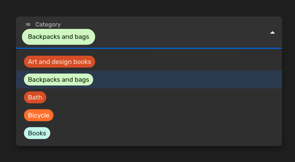
Puoi usare un campo select semplice quando vuoi permettere la selezione di un singolo valore tra un insieme limitato di opzioni. Ogni voce ha una chiave e un’etichetta. Puoi anche personalizzare il colore di ogni voce o disabilitare certe opzioni.
Imposta la prop enumValues su una configurazione valida in una proprietà stringa. Puoi
definire quei valori come array di EnumValueConfig
o semplicemente come un oggetto con coppie chiave/valore:
import { buildProperty } from "@firecms/core";
buildProperty({    dataType: "string",    name: "Categoria",    enumValues: {        art_design_books: "Libri d'arte e design",        backpacks: "Zaini e borse",        bath: "Bagno",        bicycle: "Bicicletta",        books: "Libri"    }});
oppure
import { buildProperty } from "@firecms/core";
buildProperty({    dataType: "string",    name: "Valuta",    enumValues: [        { id: "EUR", label: "Euro", color: "blueDark" },        { id: "DOL", label: "Dollari", color: "greenLight" }    ]});
Il tipo di dato è string o number.
Il componente utilizzato internamente
è SelectFieldBinding.
Campo select multiplo
Sezione intitolata “Campo select multiplo”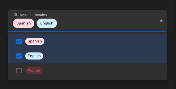
Puoi usare un campo select multiplo quando vuoi permettere la selezione di zero o più valori tra un insieme limitato di opzioni. Ogni voce ha una chiave e un’etichetta. Puoi anche personalizzare il colore di ogni voce o disabilitare certe opzioni.
Imposta la prop enumValues su una configurazione valida in una proprietà stringa. Puoi
definire quei valori come array di EnumValueConfig
o semplicemente come un oggetto con coppie chiave/valore:
import { buildProperty } from "@firecms/core";
buildProperty({    name: "Lingue disponibili",    dataType: "array",    of: {        dataType: "string",        enumValues: {            "es": "Spagnolo",            "en": "Inglese",            "fr": {                id: "fr",                label: "Francese",                disabled: true            }        }    },    defaultValue: ["es"]});
Il tipo di dato è array con proprietà stringa o numerica
come prop of, usando valori enum.
Il componente utilizzato internamente
è SelectFieldBinding.
Personalizzare i colori
Sezione intitolata “Personalizzare i colori”Puoi scegliere i colori tra un elenco di valori predefiniti:
import { ChipColorKey, ChipColorScheme } from "../components";import { hashString } from "./hash";
export const CHIP_COLORS: Record<string, ChipColorScheme> = {    blueLighter: { color: "#cfdfff", text: "#102046" },    cyanLighter: { color: "#d0f0fd", text: "#04283f" },    tealLighter: { color: "#c2f5e9", text: "#012524" },    greenLighter: { color: "#d1f7c4", text: "#0b1d05" },    yellowLighter: { color: "#ffeab6", text: "#3b2501" },    orangeLighter: { color: "#fee2d5", text: "#6b2613" },    redLighter: { color: "#ffdce5", text: "#4c0c1c" },    pinkLighter: { color: "#ffdaf6", text: "#400832" },    purpleLighter: { color: "#ede2fe", text: "#280b42" },    grayLighter: { color: "#eee", text: "#040404" },
    blueLight: { color: "#9cc7ff", text: "#102046" },    cyanLight: { color: "#77d1f3", text: "#04283f" },    tealLight: { color: "#72ddc3", text: "#012524" },    greenLight: { color: "#93e088", text: "#0b1d05" },    yellowLight: { color: "#ffd66e", text: "#3b2501" },    orangeLight: { color: "#ffa981", text: "#6b2613" },    redLight: { color: "#ff9eb7", text: "#4c0c1c" },    pinkLight: { color: "#f99de2", text: "#400832" },    purpleLight: { color: "#cdb0ff", text: "#280b42" },    grayLight: { color: "#ccc", text: "#040404" },
    blueDark: { color: "#2d7ff9", text: "#fff" },    cyanDark: { color: "#18bfff", text: "#fff" },    tealDark: { color: "#20d9d2", text: "#fff" },    greenDark: { color: "#20c933", text: "#fff" },    yellowDark: { color: "#fcb400", text: "#fff" },    orangeDark: { color: "#ff6f2c", text: "#fff" },    redDark: { color: "#f82b60", text: "#fff" },    pinkDark: { color: "#ff08c2", text: "#fff" },    purpleDark: { color: "#8b46ff", text: "#fff" },    grayDark: { color: "#666", text: "#fff" },
    blueDarker: { color: "#2750ae", text: "#cfdfff" },    cyanDarker: { color: "#0b76b7", text: "#d0f0fd" },    tealDarker: { color: "#06a09b", text: "#daf3e9" },    greenDarker: { color: "#338a17", text: "#d1f7c4" },    yellowDarker: { color: "#b87503", text: "#ffeab6" },    orangeDarker: { color: "#d74d26", text: "#fee2d5" },    redDarker: { color: "#ba1e45", text: "#ffdce5" },    pinkDarker: { color: "#b2158b", text: "#ffdaf6" },    purpleDarker: { color: "#6b1cb0", text: "#ede2fe" },    grayDarker: { color: "#444", text: "#eee" }};
export function getColorSchemeForKey(key: ChipColorKey): ChipColorScheme {    return CHIP_COLORS[key];}
export function getColorSchemeForSeed(seed: string): ChipColorScheme {    const hash: number = hashString(seed);    const colorKeys = Object.keys(CHIP_COLORS);    const index = hash % colorKeys.length;    return CHIP_COLORS[colorKeys[index]];}
Puoi anche definire colori personalizzati usando la sintassi HTML #AAAAAA:
import { buildProperty } from "@firecms/core";
buildProperty({    dataType: "string",    name: "Valuta",    enumValues: [        { id: "EUR", label: "Euro", color: "blueDark" },        {            id: "DOL",            label: "Dollari",            color: {                color: "#FFFFFF",                text: "#333333",            }        }    ]});