Select fields
Simple select field
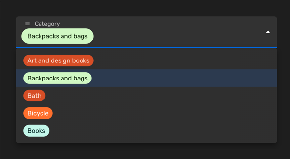
You can use a simple select field when you would like allow the selection of a single value among a limited set of options. Each entry will have a key and a label. You can also customise the color of each entry or disable certain options.
Set the enumValues prop to a valid configuration in a string property. You can
define those values as an array
of [EnumValueConfig]
or simply as an object with key/value pairs:
import { buildProperty } from "@firecms/core";

buildProperty({
    dataType: "string",
    name: "Category",
    enumValues: {
        art_design_books: "Art and design books",
        backpacks: "Backpacks and bags",
        bath: "Bath",
        bicycle: "Bicycle",
        books: "Books"
    }
});
or
import { buildProperty } from "@firecms/core";

buildProperty({
    dataType: "string",
    name: "Currency",
    enumValues: [
        { id: "EUR", label: "Euros", color: "blueDark" },
        { id: "DOL", label: "Dollars", color: "greenLight" }
    ]
});
The data type is string or number.
Internally the component used
is [SelectFieldBinding].
Multiple select field
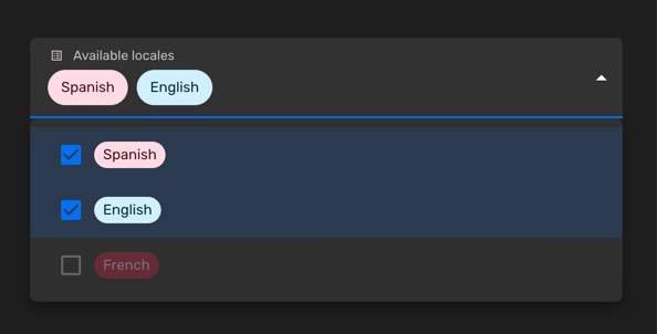
You can use a multiple select field when you would like allow the selection of a zero or more values among a limited set of options. Each entry will have a key and a label. You can also customise the color of each entry or disable certain options.
Set the enumValues prop to a valid configuration in a string property. You can
define those values as an array
of [EnumValueConfig]
or simply as an object with key/value pairs:
import { buildProperty } from "@firecms/core";

buildProperty({
    name: "Available locales",
    dataType: "array",
    of: {
        dataType: "string",
        enumValues: {
            "es": "Spanish",
            "en": "English",
            "fr": {
                id: "fr",
                label: "French",
                disabled: true
            }
        }
    },
    defaultValue: ["es"]
});
The data type is array with either string or number
properties as the of prop, using enum values.
Internally the component used
is [SelectFieldBinding].
Customising the colors
You can pick the colors among a list of predefined values:
import { ChipColorKey, ChipColorScheme } from "../components";
import { hashString } from "./hash";

export const CHIP_COLORS: Record<string, ChipColorScheme> = {
    blueLighter: { color: "#cfdfff", text: "#102046" },
    cyanLighter: { color: "#d0f0fd", text: "#04283f" },
    tealLighter: { color: "#c2f5e9", text: "#012524" },
    greenLighter: { color: "#d1f7c4", text: "#0b1d05" },
    yellowLighter: { color: "#ffeab6", text: "#3b2501" },
    orangeLighter: { color: "#fee2d5", text: "#6b2613" },
    redLighter: { color: "#ffdce5", text: "#4c0c1c" },
    pinkLighter: { color: "#ffdaf6", text: "#400832" },
    purpleLighter: { color: "#ede2fe", text: "#280b42" },
    grayLighter: { color: "#eee", text: "#040404" },

    blueLight: { color: "#9cc7ff", text: "#102046" },
    cyanLight: { color: "#77d1f3", text: "#04283f" },
    tealLight: { color: "#72ddc3", text: "#012524" },
    greenLight: { color: "#93e088", text: "#0b1d05" },
    yellowLight: { color: "#ffd66e", text: "#3b2501" },
    orangeLight: { color: "#ffa981", text: "#6b2613" },
    redLight: { color: "#ff9eb7", text: "#4c0c1c" },
    pinkLight: { color: "#f99de2", text: "#400832" },
    purpleLight: { color: "#cdb0ff", text: "#280b42" },
    grayLight: { color: "#ccc", text: "#040404" },

    blueDark: { color: "#2d7ff9", text: "#fff" },
    cyanDark: { color: "#18bfff", text: "#fff" },
    tealDark: { color: "#20d9d2", text: "#fff" },
    greenDark: { color: "#20c933", text: "#fff" },
    yellowDark: { color: "#fcb400", text: "#fff" },
    orangeDark: { color: "#ff6f2c", text: "#fff" },
    redDark: { color: "#f82b60", text: "#fff" },
    pinkDark: { color: "#ff08c2", text: "#fff" },
    purpleDark: { color: "#8b46ff", text: "#fff" },
    grayDark: { color: "#666", text: "#fff" },

    blueDarker: { color: "#2750ae", text: "#cfdfff" },
    cyanDarker: { color: "#0b76b7", text: "#d0f0fd" },
    tealDarker: { color: "#06a09b", text: "#daf3e9" },
    greenDarker: { color: "#338a17", text: "#d1f7c4" },
    yellowDarker: { color: "#b87503", text: "#ffeab6" },
    orangeDarker: { color: "#d74d26", text: "#fee2d5" },
    redDarker: { color: "#ba1e45", text: "#ffdce5" },
    pinkDarker: { color: "#b2158b", text: "#ffdaf6" },
    purpleDarker: { color: "#6b1cb0", text: "#ede2fe" },
    grayDarker: { color: "#444", text: "#eee" }
};

export function getColorSchemeForKey(key: ChipColorKey): ChipColorScheme {
    return CHIP_COLORS[key];
}

export function getColorSchemeForSeed(seed: string): ChipColorScheme {
    const hash: number = hashString(seed);
    const colorKeys = Object.keys(CHIP_COLORS);
    const index = hash % colorKeys.length;
    return CHIP_COLORS[colorKeys[index]];
}
And you can also define custom colors using the HTML syntax #AAAAAA:
import { buildProperty } from "@firecms/core";

buildProperty({
    dataType: "string",
    name: "Currency",
    enumValues: [
        { id: "EUR", label: "Euros", color: "blueDark" },
        {
            id: "DOL",
            label: "Dollars",
            color: {
                color: "#FFFFFF",
                text: "#333333",
            }
        }
    ]
});