Select fields
Simple select field
Section titled “Simple select field”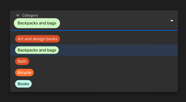
You can use a simple select field when you would like allow the selection of a single value among a limited set of options. Each entry will have a key and a label. You can also customise the color of each entry or disable certain options.
Set the enumValues prop to a valid configuration in a string property. You can
define those values as an array
of EnumValueConfig
or simply as an object with key/value pairs:
import { buildProperty } from "@firecms/core";
buildProperty({    dataType: "string",    name: "Category",    enumValues: {        art_design_books: "Art and design books",        backpacks: "Backpacks and bags",        bath: "Bath",        bicycle: "Bicycle",        books: "Books"    }});
or
import { buildProperty } from "@firecms/core";
buildProperty({    dataType: "string",    name: "Currency",    enumValues: [        { id: "EUR", label: "Euros", color: "blueDark" },        { id: "DOL", label: "Dollars", color: "greenLight" }    ]});
The data type is string or number.
Internally the component used
is SelectFieldBinding.
Multiple select field
Section titled “Multiple select field”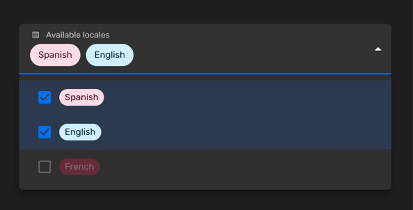
You can use a multiple select field when you would like allow the selection of a zero or more values among a limited set of options. Each entry will have a key and a label. You can also customise the color of each entry or disable certain options.
Set the enumValues prop to a valid configuration in a string property. You can
define those values as an array
of EnumValueConfig
or simply as an object with key/value pairs:
import { buildProperty } from "@firecms/core";
buildProperty({    name: "Available locales",    dataType: "array",    of: {        dataType: "string",        enumValues: {            "es": "Spanish",            "en": "English",            "fr": {                id: "fr",                label: "French",                disabled: true            }        }    },    defaultValue: ["es"]});
The data type is array with either string or number
properties as the of prop, using enum values.
Internally the component used
is SelectFieldBinding.
Customising the colors
Section titled “Customising the colors”You can pick the colors among a list of predefined values:
import { ChipColorKey, ChipColorScheme } from "../components";import { hashString } from "./hash";
export const CHIP_COLORS: Record<string, ChipColorScheme> = {    blueLighter: { color: "#cfdfff", text: "#102046" },    cyanLighter: { color: "#d0f0fd", text: "#04283f" },    tealLighter: { color: "#c2f5e9", text: "#012524" },    greenLighter: { color: "#d1f7c4", text: "#0b1d05" },    yellowLighter: { color: "#ffeab6", text: "#3b2501" },    orangeLighter: { color: "#fee2d5", text: "#6b2613" },    redLighter: { color: "#ffdce5", text: "#4c0c1c" },    pinkLighter: { color: "#ffdaf6", text: "#400832" },    purpleLighter: { color: "#ede2fe", text: "#280b42" },    grayLighter: { color: "#eee", text: "#040404" },
    blueLight: { color: "#9cc7ff", text: "#102046" },    cyanLight: { color: "#77d1f3", text: "#04283f" },    tealLight: { color: "#72ddc3", text: "#012524" },    greenLight: { color: "#93e088", text: "#0b1d05" },    yellowLight: { color: "#ffd66e", text: "#3b2501" },    orangeLight: { color: "#ffa981", text: "#6b2613" },    redLight: { color: "#ff9eb7", text: "#4c0c1c" },    pinkLight: { color: "#f99de2", text: "#400832" },    purpleLight: { color: "#cdb0ff", text: "#280b42" },    grayLight: { color: "#ccc", text: "#040404" },
    blueDark: { color: "#2d7ff9", text: "#fff" },    cyanDark: { color: "#18bfff", text: "#fff" },    tealDark: { color: "#20d9d2", text: "#fff" },    greenDark: { color: "#20c933", text: "#fff" },    yellowDark: { color: "#fcb400", text: "#fff" },    orangeDark: { color: "#ff6f2c", text: "#fff" },    redDark: { color: "#f82b60", text: "#fff" },    pinkDark: { color: "#ff08c2", text: "#fff" },    purpleDark: { color: "#8b46ff", text: "#fff" },    grayDark: { color: "#666", text: "#fff" },
    blueDarker: { color: "#2750ae", text: "#cfdfff" },    cyanDarker: { color: "#0b76b7", text: "#d0f0fd" },    tealDarker: { color: "#06a09b", text: "#daf3e9" },    greenDarker: { color: "#338a17", text: "#d1f7c4" },    yellowDarker: { color: "#b87503", text: "#ffeab6" },    orangeDarker: { color: "#d74d26", text: "#fee2d5" },    redDarker: { color: "#ba1e45", text: "#ffdce5" },    pinkDarker: { color: "#b2158b", text: "#ffdaf6" },    purpleDarker: { color: "#6b1cb0", text: "#ede2fe" },    grayDarker: { color: "#444", text: "#eee" }};
export function getColorSchemeForKey(key: ChipColorKey): ChipColorScheme {    return CHIP_COLORS[key];}
export function getColorSchemeForSeed(seed: string): ChipColorScheme {    const hash: number = hashString(seed);    const colorKeys = Object.keys(CHIP_COLORS);    const index = hash % colorKeys.length;    return CHIP_COLORS[colorKeys[index]];}
And you can also define custom colors using the HTML syntax #AAAAAA:
import { buildProperty } from "@firecms/core";
buildProperty({    dataType: "string",    name: "Currency",    enumValues: [        { id: "EUR", label: "Euros", color: "blueDark" },        {            id: "DOL",            label: "Dollars",            color: {                color: "#FFFFFF",                text: "#333333",            }        }    ]});