
Collection View Modes
FireCMS offers three different ways to visualize your collections. Each view mode is optimized for different types of data and workflows.
Available View Modes
Section titled “Available View Modes”| View Mode | Description | Best For |
|---|---|---|
| Table | Spreadsheet-like grid with inline editing | Dense data, bulk operations, detailed records |
| Cards | Responsive grid displaying thumbnails and key fields | Visual content, product catalogs, media libraries |
| Kanban | Board with columns based on a status/category field | Workflows, task management, order pipelines |
Setting the Default View
Section titled “Setting the Default View”Use the defaultViewMode property in your collection configuration:
const productsCollection = buildCollection({ path: "products", name: "Products", defaultViewMode: "cards", // "table" | "cards" | "kanban" properties: { // ... }});Users can still switch between views using the view selector in the collection toolbar — the defaultViewMode just sets what they see first.
Restricting Available Views
Section titled “Restricting Available Views”By default, all three view modes are available. Use enabledViews to restrict which views appear in the selector:
const ordersCollection = buildCollection({ path: "orders", name: "Orders", enabledViews: ["table", "kanban"], // Cards view won't be available properties: { // ... }});Table View
Section titled “Table View”The default view mode. Displays entities in a spreadsheet-like grid with support for:
- Inline editing
- Sorting and filtering
- Column resizing and reordering
- Bulk selection
Best for: User lists, transaction logs, analytics data, any collection where you need to see many fields at once.
Cards View
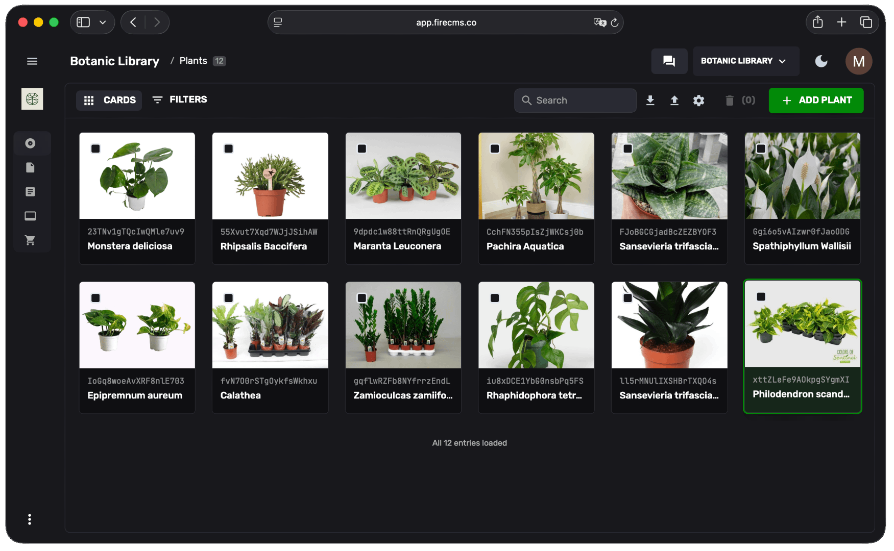
Section titled “Cards View”Transforms your collection into a responsive grid of cards. Each card displays:
- Image thumbnails (automatically detected from image properties, or explicitly set with
imageProperty) - Title and key metadata
- Quick actions
Enable Cards View
Section titled “Enable Cards View”const productsCollection = buildCollection({ path: "products", name: "Products", defaultViewMode: "cards", properties: { name: buildProperty({ dataType: "string", name: "Name" }), image: buildProperty({ dataType: "string", storage: { mediaType: "image", storagePath: "products" } }), price: buildProperty({ dataType: "number", name: "Price" }) }});Best for: Product catalogs, blog posts, media libraries, team directories, portfolios — any collection with images.
Choosing the Image Property
Section titled “Choosing the Image Property”By default, FireCMS automatically picks the first image-like property it finds (a storage property that accepts images, or a string/array property with url: "image"). If your collection has several image properties and you want to control which one is used as the card thumbnail (also used in the Kanban view), set imageProperty:
const productsCollection = buildCollection({ path: "products", name: "Products", defaultViewMode: "cards", imageProperty: "coverPhoto", // Explicitly use this property as the thumbnail properties: { name: buildProperty({ dataType: "string", name: "Name" }), coverPhoto: buildProperty({ dataType: "string", storage: { mediaType: "image", storagePath: "products" } }), gallery: buildProperty({ dataType: "array", of: buildProperty({ dataType: "string", storage: { mediaType: "image", storagePath: "products" } }) }), price: buildProperty({ dataType: "number", name: "Price" }) }});If imageProperty is not set, or references a property that doesn’t exist, FireCMS falls back to auto-detection.
Kanban View
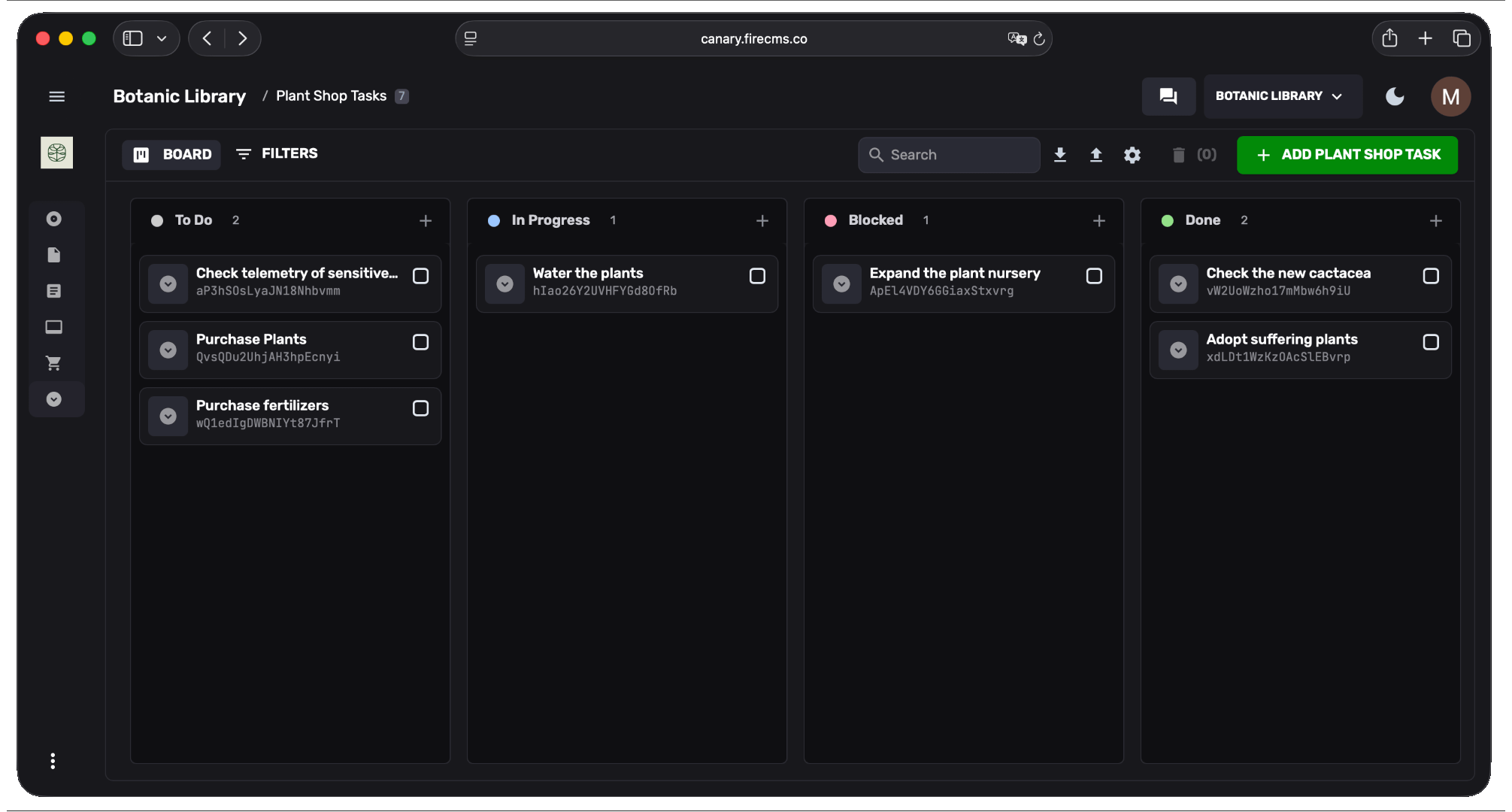
Section titled “Kanban View”Displays entities as cards organized into columns based on an enum property. Drag and drop cards between columns to update their status.
Auto-Detection
Section titled “Auto-Detection”The Kanban view is automatically available for any collection that has at least one string property with enumValues defined. No additional configuration is required — just define your enum property and the Board option will appear in the view selector.
Setting a Default Column Property
Section titled “Setting a Default Column Property”When your collection has multiple enum properties, you can set which one is used for columns by default with the kanban config. Users can switch between enum properties from the view selector.
const tasksCollection = buildCollection({ path: "tasks", name: "Tasks", defaultViewMode: "kanban", kanban: { columnProperty: "status" // Optional: pre-selects which enum to group by }, properties: { title: buildProperty({ dataType: "string", name: "Task" }), status: buildProperty({ dataType: "string", name: "Status", enumValues: { todo: "To Do", in_progress: "In Progress", review: "Review", done: "Done" } }) }});Drag and Drop Reordering
Section titled “Drag and Drop Reordering”To enable reordering cards within a column, add an orderProperty:
const tasksCollection = buildCollection({ path: "tasks", name: "Tasks", defaultViewMode: "kanban", kanban: { columnProperty: "status" }, orderProperty: "order", // Must reference a number property properties: { title: buildProperty({ dataType: "string", name: "Task" }), status: buildProperty({ dataType: "string", name: "Status", enumValues: { todo: "To Do", in_progress: "In Progress", done: "Done" } }), order: buildProperty({ dataType: "number", name: "Order" }) }});The orderProperty uses fractional indexing to maintain order without rewriting every document on each reorder.
Best for: Task management, order fulfillment, content pipelines, support tickets, hiring workflows — any collection with distinct stages.
Configuration in FireCMS Cloud
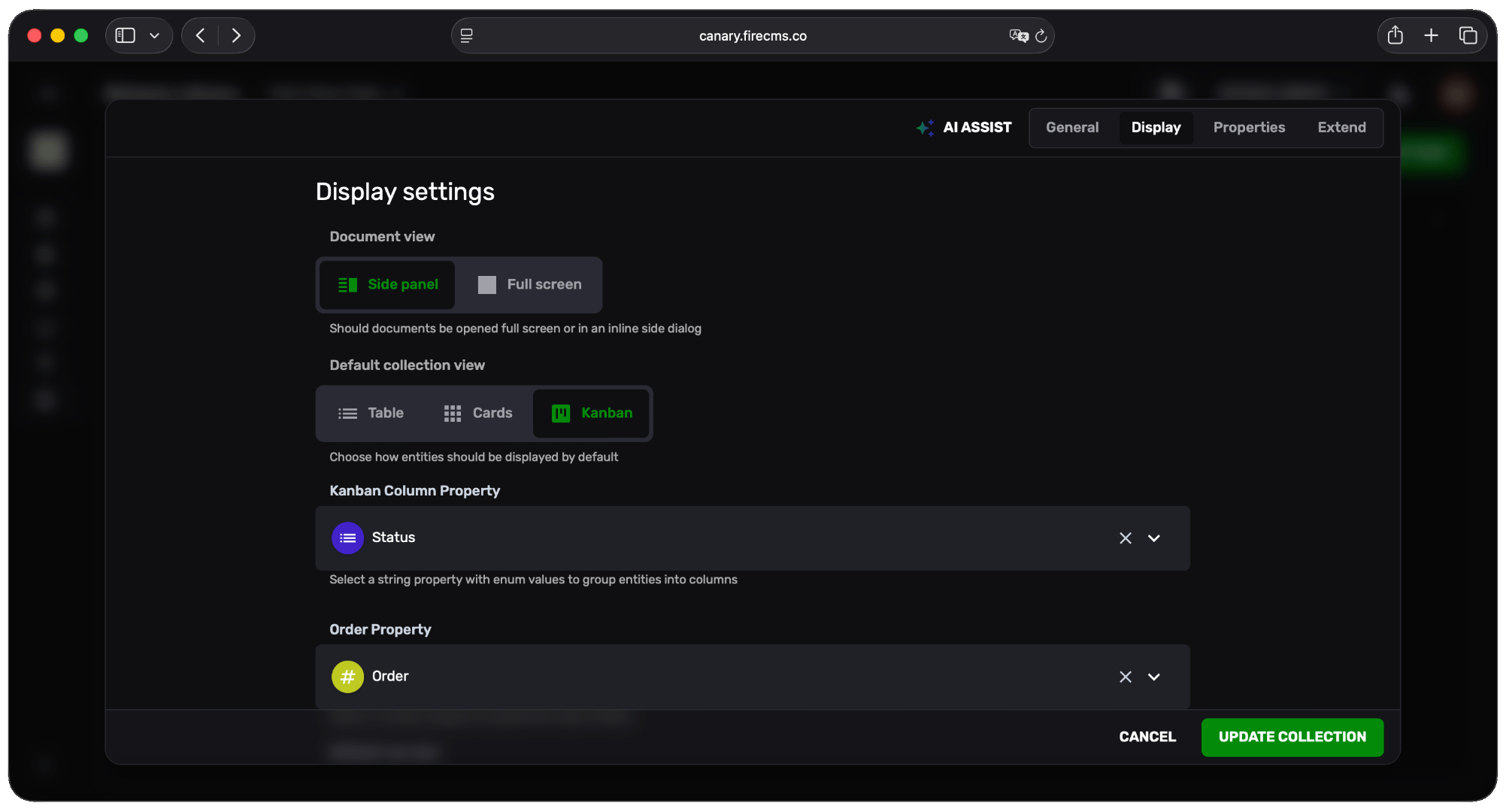
Section titled “Configuration in FireCMS Cloud”If you’re using FireCMS Cloud, you can configure view modes through the UI without writing code:
- Open your collection settings
- Go to the Display tab
- Select your Default collection view (Table, Cards, or Kanban)
- Optionally choose an Image Property to control the thumbnail used in Cards and Kanban views
- For Kanban, choose the Kanban Column Property and optionally an Order Property