Text fields
Simple text field
Section titled “Simple text field”
The most basic widget is the text field, which allows the user to input simple strings.
If you define a string property with no other configuration parameters, you will get a text field:
import { buildProperty } from "@firecms/core";
buildProperty({    dataType: "string",    name: "Name",    validation: {        // ...    }});
The data type is string or number.
Internally the component used
is TextFieldBinding.
Multi line text field
Section titled “Multi line text field”
Use a multiline field when you want to enable the user to input strings that may contain line breaks.
Set the multiline flag to true in a string property.
import { buildProperty } from "@firecms/core";
buildProperty({    dataType: "string",    name: "Description",    multiline: true,    validation: {        // ...    }});
The data type is string.
Internally the component used
is TextFieldBinding.
Markdown text field
Section titled “Markdown text field”
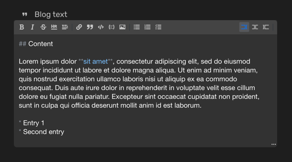
You can use a markdown field when you would like the end user to use advanced editing capabilities of text using the Markdown format.
Set the markdown flag to true in a string property.
import { buildProperty } from "@firecms/core";
buildProperty({    dataType: "string",    name: "Blog text",    markdown: true,    validation: {        // ...    }});
The data type is string.
Internally the component used
is MarkdownEditorFieldBinding.
Url text field
Section titled “Url text field”
You can use a URL field when you would like to ensure that the input of the end user is a valid URL.
Set the url flag to true in a string property.
import { buildProperty } from "@firecms/core";
buildProperty({    dataType: "string",    name: "Amazon link",    url: true,    validation: {        // ...    }});
The data type is string.
Internally the component used
is TextFieldBinding.
Email field
Section titled “Email field”
You can use an email field when you would like to ensure that the input of the end user is a valid email.
Set the email flag to true in a string property.
import { buildProperty } from "@firecms/core";
buildProperty({    dataType: "string",    name: "User email",    email: true,    validation: {        // ...    }});
The data type is string.
Internally the component used
is TextFieldBinding.

